Data Plots
Data plots provide an accessible and
efficient way to extract insights from complex data,
helping both analysts and non-technical stakeholders understand
and interpret results.
Data plots are crucial in data science
because they help:
visualize trends, distributions, and relationships,
explore data, detect outliers,
diagnose model performance, and communicate findings
effectively.
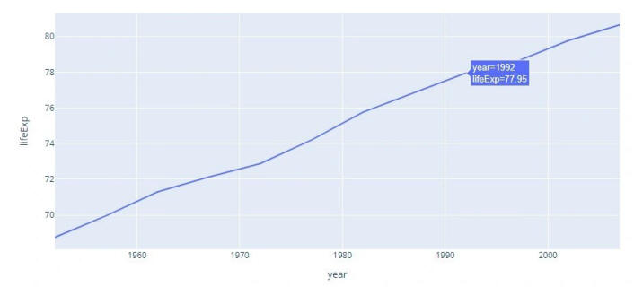
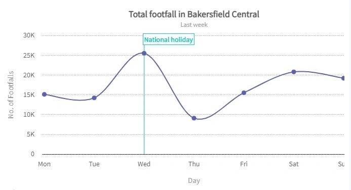
Line Graph / Spline Chart
It displays a sequence of data points as markers. The points are ordered typically by their x-axis value. These points are joined with straight line segments. A line graph is used to visualize a trend in data over intervals of time.
A spline chart is a line chart. It connects each data point from the series with a fitted curve that represents a rough approximation of the missing data points.
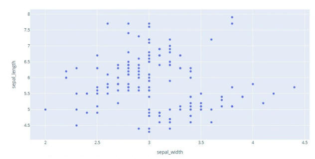
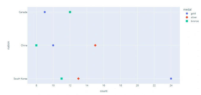
Scatter plots
It is a type of plot using Cartesian coordinates to display values for two variables for a set of data. It is displayed as a collection of points. Their position on the horizontal axis determines the value of one variable. The position on the vertical axis determines the value of the other variable. A scatter plot can be used when one variable can be controlled and the other variable depends on it. It can also be used when both continuous variables are independent.
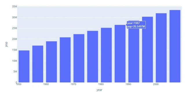
Bar Graph
A bar graph is a graph that presents categorical data with rectangle-shaped bars. The heights or lengths of these bars are proportional to the values that they represent. The bars can be vertical or horizontal. A vertical bar graph is sometimes called a column graph.
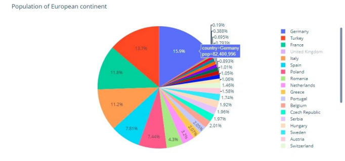
Pie Chart
A pie chart is a circular statistical graphic. To illustrate numerical proportion, it is divided into slices. In a pie chart, for every slice, each of its arc lengths is proportional to the amount it represents. The central angles, and area are also proportional. It is named after a sliced pie.
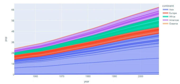
Area Chart
It is represented by the area between the lines and the axis. The area is proportional to the amount it represents.
Dot Graph
A dot graph consists of data points plotted as dots on a graph.
There are two types of these:
"Wilkinson Dot Graph":
In this dot graph, the local displacement is used to prevent the
dots on the plot from overlapping.
"Cleaveland Dot Graph":
This is a scatterplot-like chart that displays data vertically
in a single dimension.
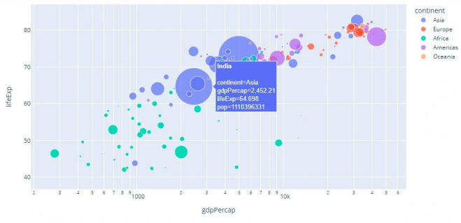
Bubble Chart
A bubble chart displays three attributes of data. They are represented by x location, y location, and size of the bubble.
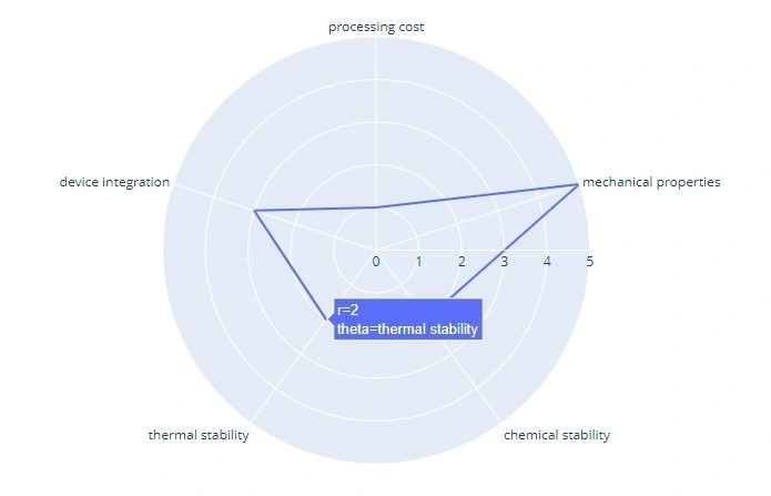
Radar Chart
It is a graphic displaying data that consists of many independent variables. It is shown as a two-dimensional chart of three or more quantitative variables. These variables are shown on axes starting from the same point.
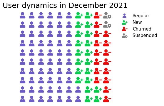
Pictogram Graph
It uses icons to provide a more engaging overall view of small sets of discrete data. Additionally, the icons represent the subject or category of the underlying data. For example, population data would utilize icons of people. Furthermore, each icon can represent one or many units, such as a million. Moreover, side-by-side comparison of data is facilitated through columns or rows of icons. This enables a clear comparison of each category to one another.
----plotly and seaborn cheatsheet
The five-number summary
of a dataset consists of:
Minimum: The smallest value in the dataset.
First Quartile (Q1): The median of the lower
half of the dataset (25th percentile).
Median (Q2): The middle value of the dataset
(50th percentile).
Third Quartile (Q3): The median of the upper
half of the dataset (75th percentile).
Maximum: The largest value in the dataset.
Boxplot: real name is box-and-whisker plots.
• Draw a box from the lower quartile to
the upper quartile.
• Extend a whisker from the ends of the box to the
furthest observation which is no more than 1.5 times
inter-quartile range from the box.
• Mark any observations beyond this as “outliers”.

A histogram is an approximate representation of the distribution of numerical data. The data is divided into non-overlapping intervals called bins and buckets. A rectangle is erected over a bin whose height is proportional to the number of data points in the bin. Histograms give a feel of the density of the distribution of the underlying data.
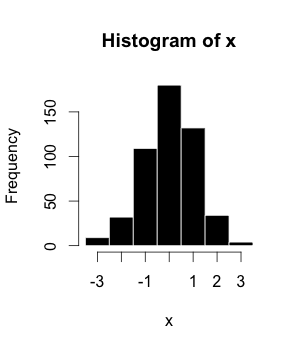
Histograms are sometimes confused with bar charts.
In a histogram, each bin is for a different range of values, so altogether the histogram illustrates the distribution of values. But in a bar chart, each bar is for a different category of observations (e.g., each bar might be for a different population), so altogether the bar chart can be used to compare different categories.
Some authors recommend that bar charts always have gaps between the bars to clarify that they are not histograms.
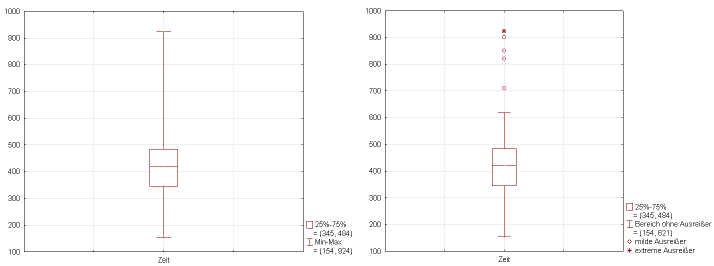
Histograms Often Tell More than Boxplots.
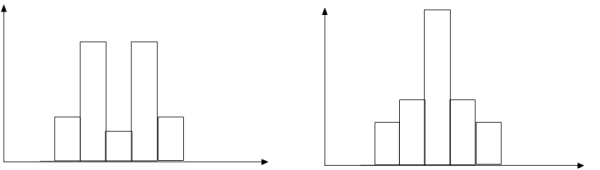
The two histograms shown in the figure
have the same boxplot representation.
The same values for: min, Q1, median, Q3, max.
But they have rather different data distributions.
In statistics, the k-th percentile of a set of values divides them so that k% of the values lie below and (100 − k)% of the values lie above.
• The 25th percentile is known as the
lower quartile.
• The 50th percentile is known as the median.
• The 75th percentile is known as the upper quartile.
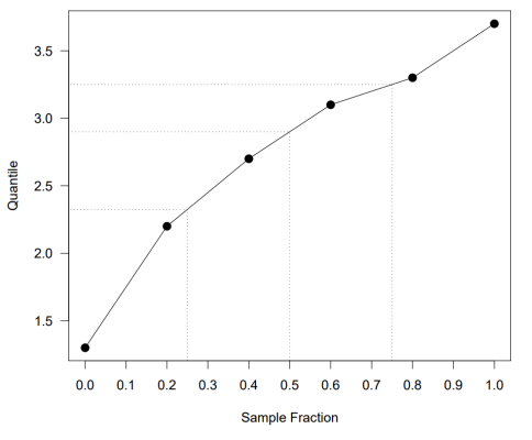
It is more common in statistics to refer to quantiles. These are the same as percentiles, but are indexed by sample fractions rather than by sample percentages.
The definition of quantiles and percentiles is not completely satisfactory.
For example, consider the six values:
3.7 2.7 3.3 1.3 2.2 3.1
What is the lower quartile of these values?
There is no value which has 25% of these
numbers below it and 75% above.
To overcome this difficulty we will use a definition of
percentile which is in the spirit of the above statements, but
which (necessarily) makes them hold only approximately.
Associate the ordered values with sample fractions equally spaced from zero to one.
| Sample fraction | 0 | 0.2 | 0.4 | 0.6 | 0.8 | 1 |
| Quantile | 1.3 | 2.2 | 2.7 | 3.1 | 3.3 | 3.7 |
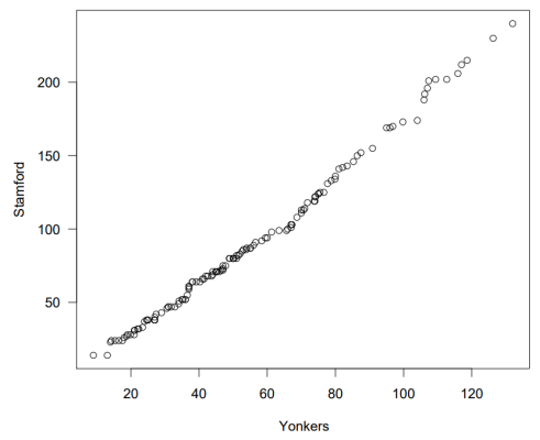
Quantile-Quantile (Q-Q) Plot
Graphs the quantiles of one univariate distribution against the corresponding quantiles of another.
A heat map (or heatmap) is a 2-dimensional data visualization technique that represents the magnitude of individual values within a dataset as a color.
The variation in color may be by hue or intensity. In some applications such as crime analytics or website click-tracking, color is used to represent the density of data points rather than a value associated with each point.
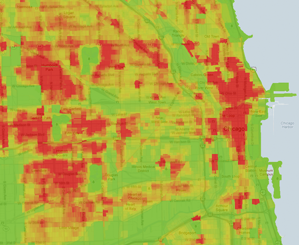
The violent crimes map of Chicago, generated by trulia.
How about this heatmap?
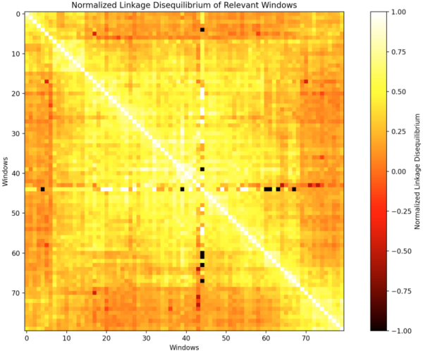
This heat map shows the normalized linkage disequilibrium of Genomic Windows within the Hist1 region of a mouse.
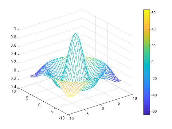
Mesh
A mesh plot is used to visually represent a 3D surface by displaying only the connecting lines between data points, creating a "wireframe" appearance, which is particularly useful for understanding the shape and contours of a surface without being obscured by color-filled faces, often used in fields like engineering and scientific visualization to analyze data across multiple variables in 3D space.